
How lucky are we to live in a country where the start of summer and the festive season coincide? At this time when people are starting to relax and are eager to celebrate life and all that is happy, we asked a few colour experts what we could do to ensure our homes reflect our need for comfort and positivity.
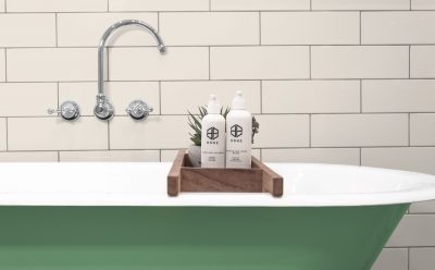
Currently one of the biggest interior trends is a move towards sludgy, moody colours that are deep and delicious. These tones are applied to both soft accessories like bedding, cushions and curtains, but also to larger pieces such as couches, and then to expansive surfaces like walls and counters. While it may seem strange to turn to the darker hues for feelings of happiness, the experts at Plascon and Bondthrucolour tell us that this is in fact a quiet antidote to the saturated, riotous colour blocking that was popular a few years ago.
It’s not difficult to understand why this trend is surfacing for the home. After the stresses of the Covid lockdown, people are now seeking comfort and healing. In this time of social, information and emotional overload, the world is searching for wellness. People are yearning for community, connection and peace – and colour has the ability to assuage some of these longings.
Colour expert and qualified chromatherapist from of Bondthrucolour, Claire Bond says, “Correct colour placing is critical so as not to overstimulate or depress the occupants of the space. These deeper, richer colours are better in residential projects, where they give a more comforting, homier feeling.”
Plascon retail marketing manager Nozipho Kunene, who steers Plascon’s colour trends advice service, says, “There’s something about dark-hued rooms that provides a sense of tranquillity.”
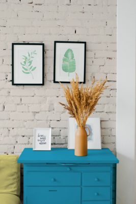
Darker rooms make excellent relaxing spaces – and soothing and healing is something many of us need after the stress and anxiety of lockdown. If you find that you are gravitating towards an interior palette that is deep and dark, now you know why! You’re simply embracing the mood of the times.
Good news is that darker colours work extremely well in homes that are filled with natural light, which means you can redecorate your beach house in these hues, or simply add touches of deeper colour via carefully placed accessories. In fact, did you know that too much white in a space can be overstimulating? But it is best not to use a deeper décor palette in areas where the room does not receive enough natural light as it may end up looking dark and gloomy, instead of moody.
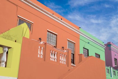
For spaces that don’t receive much natural light, use a lighter palette. For Summer 2020/21 Plascon’s colour advisory team has predicted a mid-tone palette that is designed to warm these spaces. Paying homage to the great South African summer, their new City to Surf collection celebrates sun-kissed red, orange, yellow, green, lilac and faded blues. These colours do pop harder than pastels but they are not the strident, saturated brights that were popular some years back. They are softer and gentler. When used in your home, the feeling that mid-tones create is cheerful and optimistic, while also being laid-back and carefree – exactly like that year-end holiday vibe. Use this décor direction to liven up your holiday home or bring a new feeling of happiness and excitement into your urban abode. And bring on those lazy, hazy, crazy days of summer.
For free advice on how to use City to Surf, or any other Plascon colours, please contact the Plascon Colour Advice team via email: [email protected].


