
 (002)")
Set the tone for the new year with this year’s colour palette, which encourages calm, optimism, and balance.
We will, this year, be celebrating more than just new beginnings. We’re also celebrating a newfound appreciation for our wellbeing and an opportunity to create positive transformation. What better way to feel restored and reset than by looking to the healing properties of nature?
That’s the reasoning behind Plascon’s 2022 Colour Combination of the Year, featuring earthy Africa-inspired hues.
Plus, they say, just as in nature, colours come to life in harmony. Which is why this year, Plascon has given us not just one colour, but has brought together three beautiful hues in a combination to capture the mood of the year. These colours pay homage to the natural African landscape outside of our homes while bringing the simple pleasures of nature inside.
The colour combination works in a 60:30:10 ratio, a ratio which aligns with best design practices that the industry utilises, and a great idea for you to keep in mind when decorating. The basics are … 60 per cent of a space should consist of a dominant colour, 30 per cent a secondary colour, and 10 per cent an accent colour.
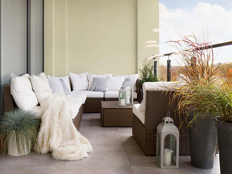
This year the hero – or dominant – colour representing 60 per cent of the ratio is Plascon Pear Fantasy (Y5-B2-1). This soft yellow-green makes for a modern, neutral shade while being comfortingly familiar. Capturing the soothing charm of a sandy shore at sunrise, this shade instantly puts our minds at ease and enlivens our spaces.
Then 30 per cent of the colour combo ratio is Plascon Desert Water (B5-B2-2) – a calming and uplifting pale blue hue with an illuminating touch of purple. Inspired by the sunlit surface of tranquil water, this shade is subtle yet impactful, perfectly complementing the neutral Pear Fantasy. Lighter blue shades are associated with health, healing, tranquillity, and softness.
Rounding off the ratio, Plascon Zanzibar (70) makes up the final 10 per cent. Described as a soft yet grounded colour, there’s a quiet warmth to this gentle smoky brown that brings an anchoring balance to lighter, cleaner hues. Capturing the fresh soil and majestic tree trunks of an early morning trail, this colour brilliantly accentuates the other two shades.
Adding to the appeal is the local reflection of this combination. Very often, trends that filter down to us from Europe or the USA don’t really work in an African reality. But these colours – and even the names – have been chosen to reflect a specifically African context … colours that reflect the way we live here, and that are created with Africa in mind.


