
What better way to feel restored and reset than by looking to the healing properties of nature? That’s the reasoning behind Plascon’s 2022 Colour Combination of the Year, featuring earthy Africa-inspired hues.
Just as in nature, colours come to life in harmony. Which is why Plascon has given us not just one colour, but has brought together three beautiful hues in a combination to capture the mood of the year. These colours pay homage to the natural African landscape outside of our homes while bringing the simple pleasures of nature inside.
The colour combination works in a 60:30:10 ratio, which aligns with best design practices the industry utilises, and a great idea for you to keep in mind when decorating. The basics are … 60 per cent of a space should consist of a dominant colour, 30 per cent a secondary colour, and 10 per cent an accent colour. This year the hero – or dominant – colour is Plascon Pear Fantasy (Y5-B2-1). This soft yellow-green makes for a modern, neutral shade while being comfortingly familiar. Capturing the soothing charm of a sandy shore at sunrise, this shade instantly puts our minds at ease and livens our spaces.
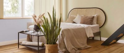
Then 30 per cent of the colour combo ratio is Plascon Desert Water (B5-B2-2) – a calming and uplifting pale blue hue with an illuminating touch of purple. Inspired by the sunlit surface of tranquil water, this shade is subtle yet impactful, perfectly complementing the neutral Pear Fantasy. Lighter blue shades are associated with health, healing, tranquillity, and softness.
Rounding off the ratio, Plascon Zanzibar (70) makes up the final 10 per cent. Described as a soft yet grounded colour, there’s a quiet warmth to this gentle smoky brown that brings an anchoring balance to lighter, cleaner hues.
Capturing the fresh soil and majestic tree trunks of an early morning trail, this colour brilliantly accentuates the other two shades. Adding to the appeal is the local reflection of this combination. Very often, trends that filter down to us from Europe or the USA don’t really work in an African reality. But these colours – and even the names – have been chosen to reflect a specifically African context … colours that reflect the way we live here, and that are created with Africa in mind.

PURE AROMATHERAPY
Staying with the theme of bringing calm and balance into our lives, we’re loving our Organic Aromas Nebulizing Diffuser for Aromatherapy. This Raindrop Light is so gorgeous … it’s refined and elegant, with a handmade wood base and custom-blown glass diffuser. So it sits jolly prettily alongside our home decor pieces. No plastic here. No water or heat, either, which is another reason why we’re so keen. It uses only essential oils – and talking oils, the team at Organic Aromas guarantee these really are ‘pure organic oils’, and have the testing stats to back up their promise. They’re certainly potent … we tested the diffuser in an open plan area and the scent wafted from one room to the next beautifully. The diffuser has a switch allowing you to control how much oil you want to release, and works on a two-minutes-on, one-minute-off basis, turning off completely after two hours. There is rotating rainbow LED mood lighting … if you’re not a fan and prefer no glow, it has an easy-to-turn-off function. There are five equally attractive designs to choose from, and a dozen essential oils, and there are great kits, too. Diffusers R1650, oils from R185, from organicaromas.co.za


